This year you may have noticed that our website changed. In January, we launched an updated website on a new platform after several months of hard work. To build upon the momentum that came with the external website rebuild, we decided to take a fresh look inward in 2021, starting with our mission, vision, and values. In a time where connection has become more important than ever before, we hope our updated corporate language helps to better connect our employees to each other, our clients, and our communities.
Brand Voice
IntelliDyne has been providing exceptional IT services to the Federal Government for over 20 years. During that time, we’ve grown from a small business to a large company, expanding our offerings from core infrastructure support to innovative, cutting-edge solutions. Shouldn’t our brand story reflect that transformation?
IntelliDyne was established in 1999 by Founder and CEO, Robert Grey. The name IntelliDyne is derived from three words: Intelligence, Intelligent, and Dyne.
Intelligence: The ability to acquire and apply knowledge and skills; the collection of information of military or political value.
Intelligent: Having the ability to shift a current state or action in response to varying situations, varying requirements, and past experience.
Dyne: A unit of force that, acting on a mass of one gram, increases its velocity by one centimeter per second every second along the direction
that it acts.
The fusion of these three words and their meanings was intentional, implying intelligence and force towards a greater good than ourselves. While this ideal has not changed, the way we talk about it has:
Our Mission: We empower the federal workforce through the delivery of quality, mission-aligned services, and innovative, people-first IT solutions.
Our Vision: To be a leading IT services provider, sought after for unparalleled service delivery, high value, and innovative solutions.
Our Values: Inclusion, Integrity, Service.
Brand Visuals
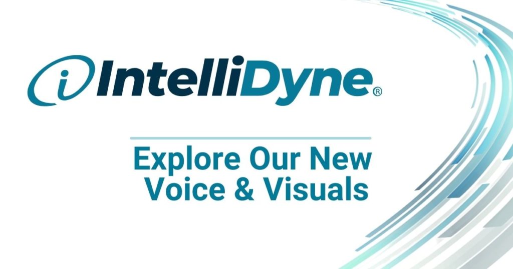
To help our new language and brand promise have an even greater impact, we choose to more closely examine the relevancy of our visual brand identity. This week we are pleased to release our modernized logo, along with new typography, and style guidelines for our employees.
In the ten years since our last update, IntelliDyne has grown and evolved considerably. For the second time in the company’s history, we have refreshed our logo to better represent the company today, displaying a more current, modernized look.
Our previous logo was based on a font that was created in the 1950’s, demonstrating that we were long-standing and rooted in history. We have revitalized our new logo by incorporating a clean, open-face font. Each character has both sharp and smooth edges – an acknowledgment not only of IntelliDyne’s cutting-edge solutions (sharp edges) but also of our adaptable/flexible approaches (smooth/rounded edges).
In a nod to the company’s history, the new logo font integrates an intentional curvature to better tie in with the shape of the i-Mark, an integral component of the IntelliDyne brand, while also indicating the forward progress of the company in over 20 years of service to the Federal Government.
This year holds the promise of big changes for IntelliDyne. We’re happy for the opportunity to share just a few of them with you now. Learn more about us and join our growing team!